
Decor Crush: Basil & Ford
I am a big fan of cool art in the home and when I came across design duo Basil & Ford, I fell in love with their 'Blooming Marvellous' print on first sight and knew it had to feature somewhere in our home.
Basil & Ford are completely unique in their designs, especially with their use of vintage book pages and cool bright typography to create artwork that is fun and modern but also full of history.
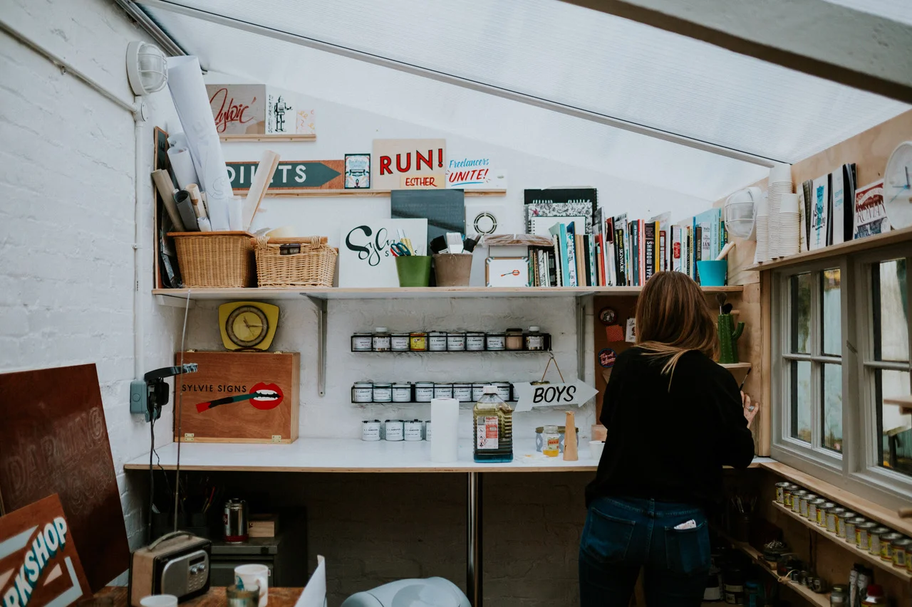
Basil & Ford are Matt and Lucy, who are a husband and wife team (which I think is just lovely) and the name comes from Matt's home town of Basildon and Lucy's home town of Stamford, thus creating Basil & Ford. They now reside together in Stamford with their children and they work from their own design studio.
From chatting to Matt for this Decor Crush feature, he seems a rather lovely man and it's a quality which seems to radiate through their business, from their website to the personal touches they send with orders, such as a lovely handwritten note and cool postcard. Their motto is 'Mighty Fine Things For Mighty Fine People' and as the proud owner of their 'Blooming Marvellous' print, I can tell you first hand that their products are indeed mighty fine.
Along with prints using vintage botanical plates, they also have lots of cool typography prints and some cool foodie prints which would look fab in a kitchen to add a pop of colour - there are some fun tea towels to buy alongside your kitchen prints too! If you're a stationary lover (hello, that's me), then they also sell a range of cards, wrapping paper, notebooks and even offer a bespoke wedding stationary service.
As two very cool people inspired by design, I was excited to interview Matt and Lucy for the next instalment of my Decor Crush series. Here are their answers to my questions, where you'll learn more about them and their fantastic business...
1. How would you define your style?
Clean, bold and striking typography paired with original vintage book plates.
2. What inspires your work?
Everything and anything. Ideas can come at any time or place. An idea for a new print tends to come in secondhand book shops where I trawl the shelves hunting for book plates, that will ultimately lend themselves to an up cycle with an introduction of our typography. Although I sat on a book from the mid 1950’s of stunning illustrations of WWII warships for over 3 years. I loved the illustrations and knew they would be wonderful for something. I didn’t know what to print on them until Donald Trump sent a warship in the direction of North Korean waters. It sparked something and a day or two later we printed ‘Make Waves Not War’ over the top in a fluorescent pink ink.
3. How did you get to where you are today?
When we were trying to source our wedding invitations we knew we wanted to use white ink. This was before the rise of digital white ink being available, we decided to screen print our own. We’d dabbled back at uni, it’s safe to say we were rusty. The big day came and went, a year later Lucy was pregnant with our first little one and we were at a crossroads. All we knew is that we didn’t want to raise our family in London. Basil & Ford was born. We upped sticks, returning to the sticks. Moving back to Lucy’s home town of Stamford. We began the business in a dark and dank old out building. Growing our range and perfecting our skills. 4 years down the line we are now proudly creating our wares in a warm and water tight studio.
4. What new projects do you have coming up?
We have an exciting exclusive range we’re creating for the V&A. It’ll be using original illustrated vintage book plates of the great ocean liners of yesteryear paired with our typographic designs.
5. Who or what is your décor crush?
We adore the beautiful simplicity of Scout Editions. Everything they design makes me think ‘I wish I’d done that’.
Of course the blog's tagline is 'Dining, Destinations, Decor' so I had to ask the duo's favourites...
• Favourite Dining Spot?
We absolutely love a burger. Byron Burger make a mean one. They also serve all their burgers with a big old pickle. What’s not to like. Their branding is second to none, from the menu design to their unique venue locations. I love how they create bespoke identities for signature burgers. A fair few have been designed by Crispin Finn. A husband and wife design team that are famed for working with only two colours. Principally red and blue. I admire their ability to simplify anything to due tone. ‘Le Smokey’ is a particular favourite. I always keep the business cards they give you when you get the bill. They’re designed like playing cards, each eatery is dedicated to it’s own number and suit. We’re on our way to a full pack. Or anywhere that sells a good oyster.`
• Favourite Destination?
Both Luce and I would love to visit India. I’d love to visit for the food, the smells, the colours, the hustle and bustle. Whilst Luce would go for the fabrics. That day will certainly come once the little people in our lives have grown up.
• Favourite Décor?
Industrial. Exposed brick walls. Copper piping. Old factory light fittings. Basically anything Drew Pritchard would pick up after a rummage in a dusty old shed.
There's a new bar/restaurant just opened up in our town. It's called Paten & Co. The interior design is wondrous. Industrial. Exposed brick work. Stripped parquet flooring. Salvaged fixtures and fittings. Subway tiles. Bit of neon signage. The food is also something else.
I shall be putting my fabulous Blooming Marvellous print on the wall as soon as I have it framed and I can't wait. Have a look at the fabulous designs available to buy over on Matt & Lucy's website here - thanks to them for answering my Decor Crush questions!